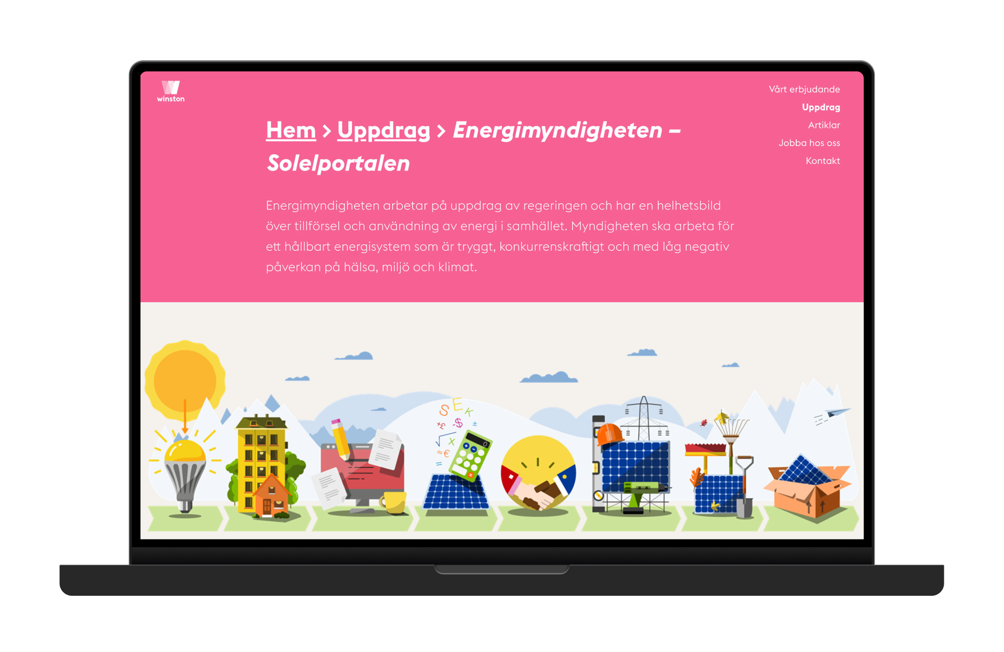

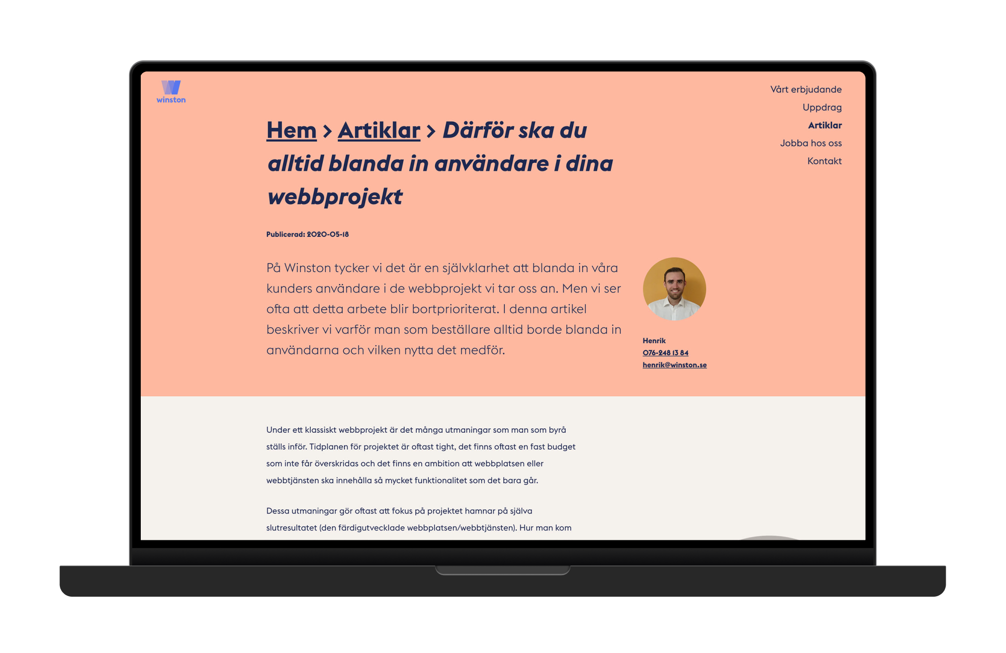

Brand update for digital design agency Winston DC, while employed at the agency. Winston DC were early in creating web design projects with high accessibility rating – long before it became mandatory in public procurements – so internal standards were set high regarding contrast and legibility as well as for technical accessibility such as screen readers and keyboard navigation.
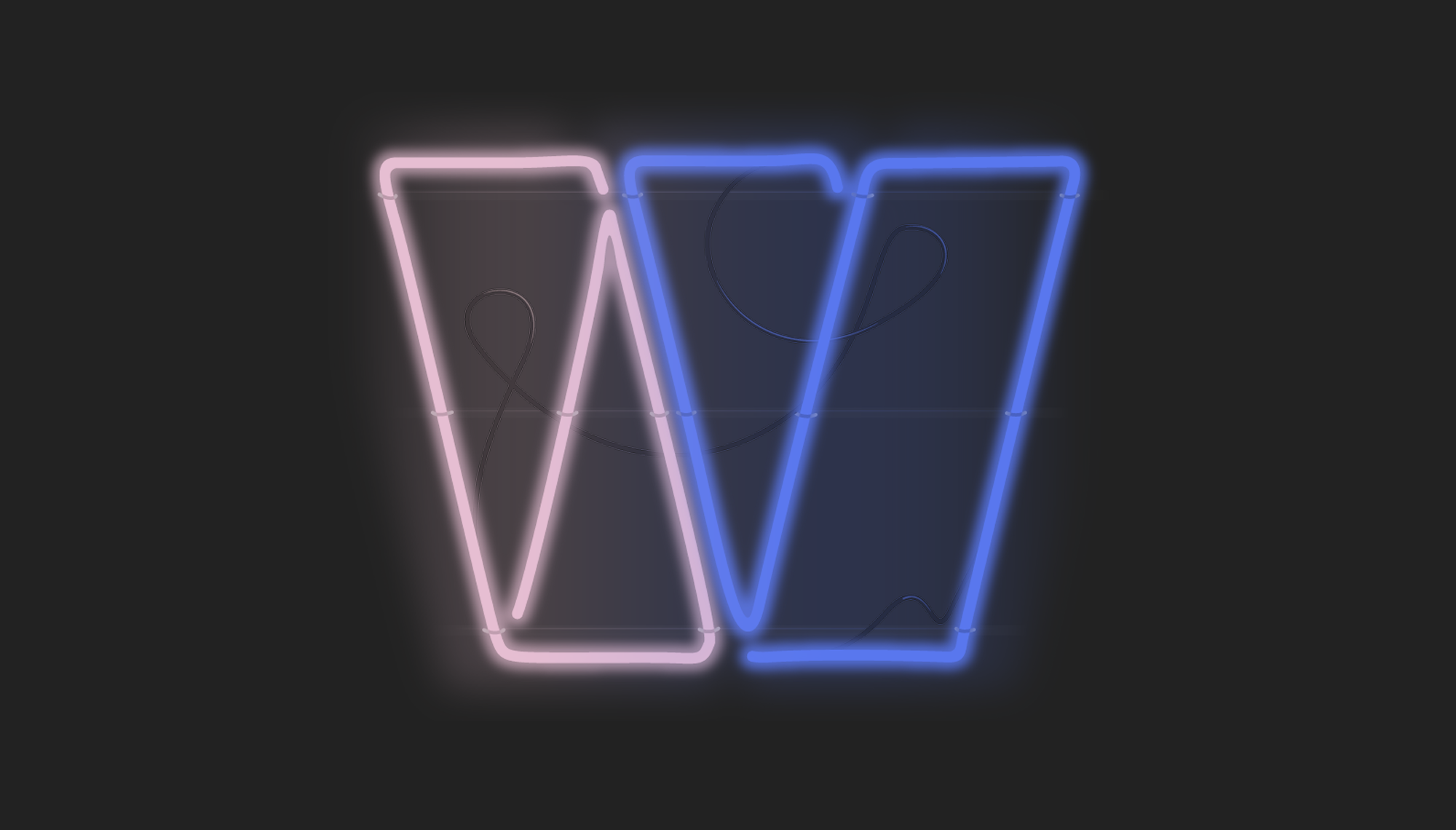
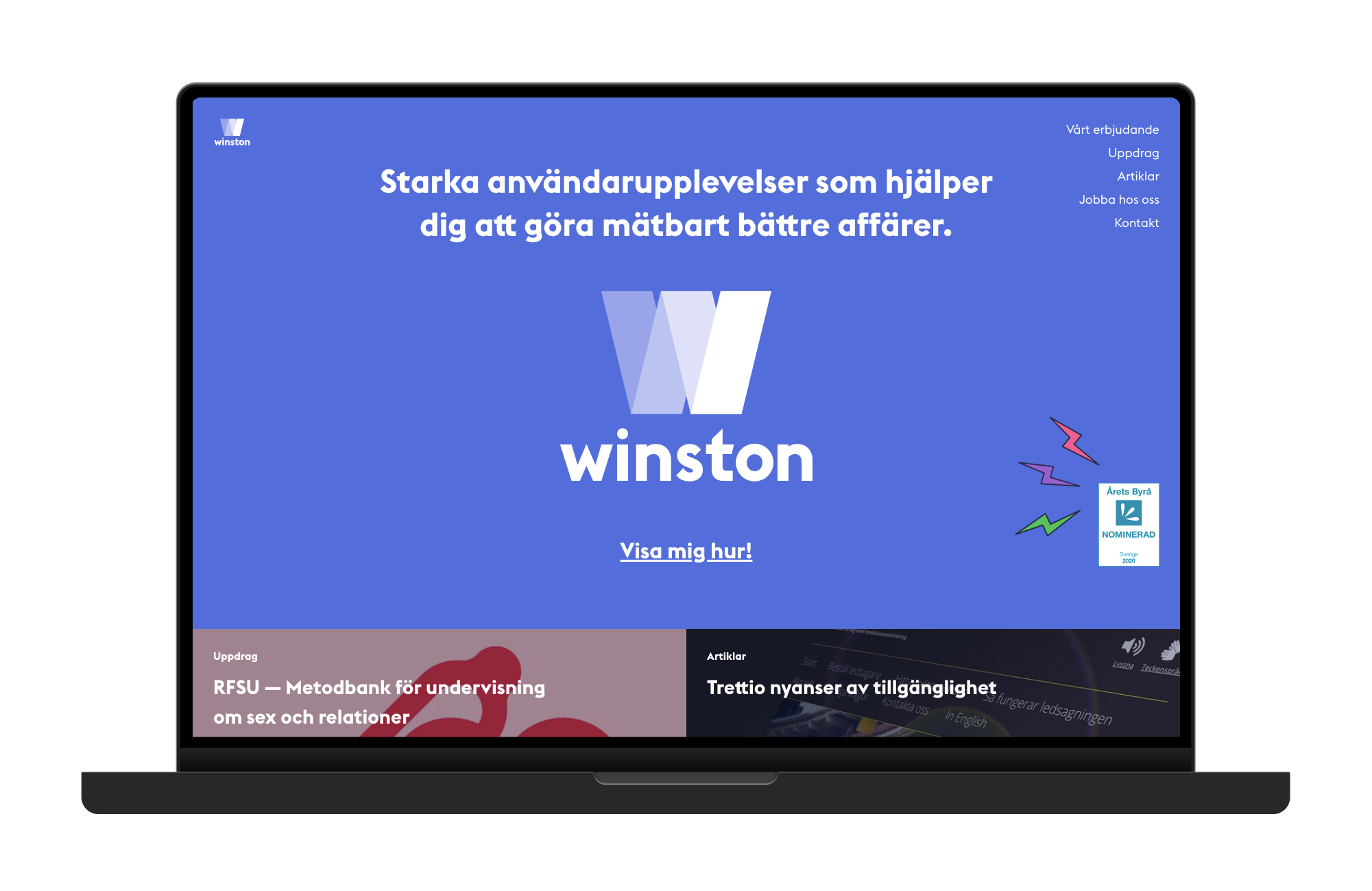
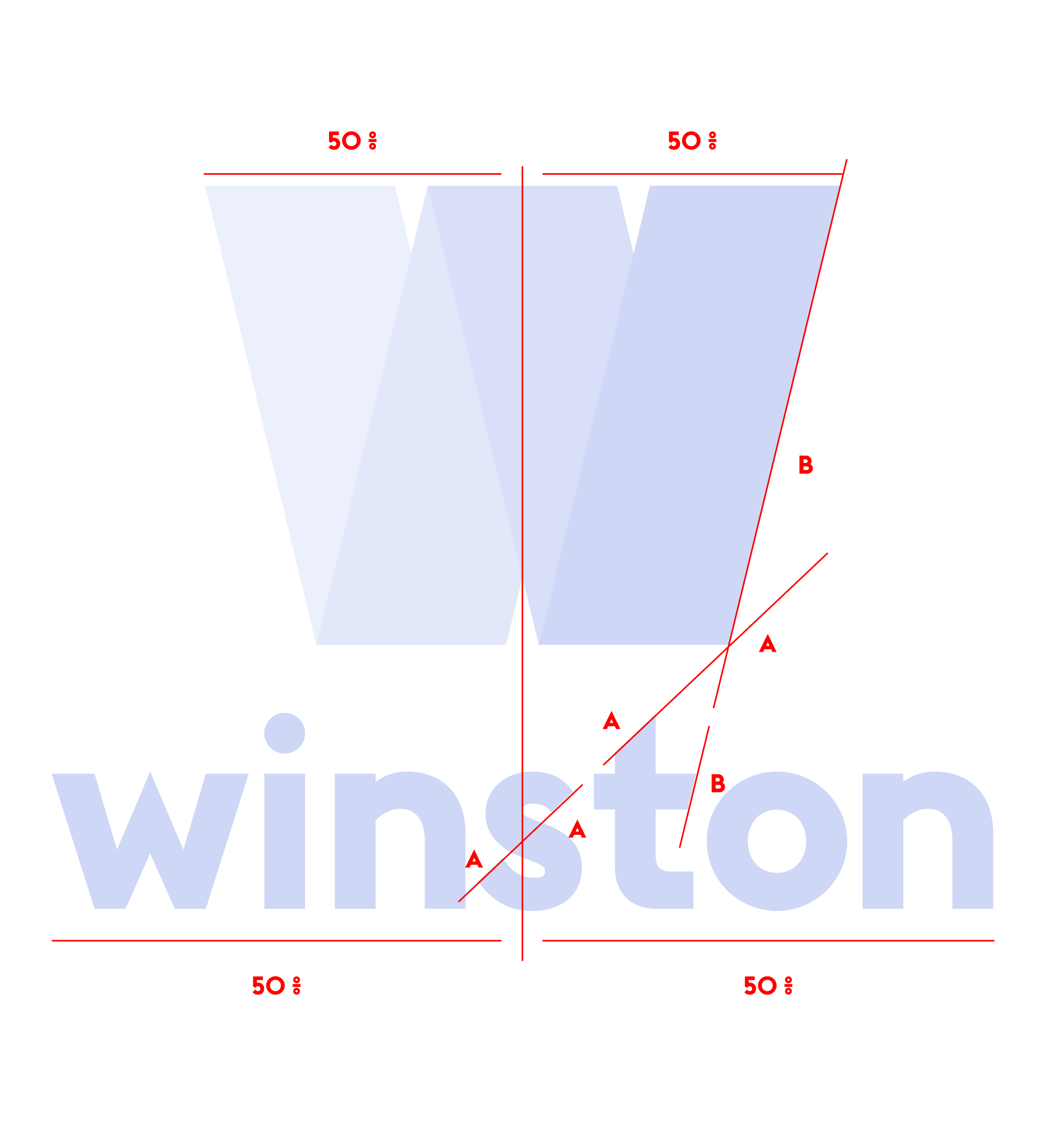
In many cases we leaned into the WCAG guidelines. The extreme-sized breadcrumb is an example of this, as is the colorful palette of the visual identity were every color met triple-A legibility with black or white text.
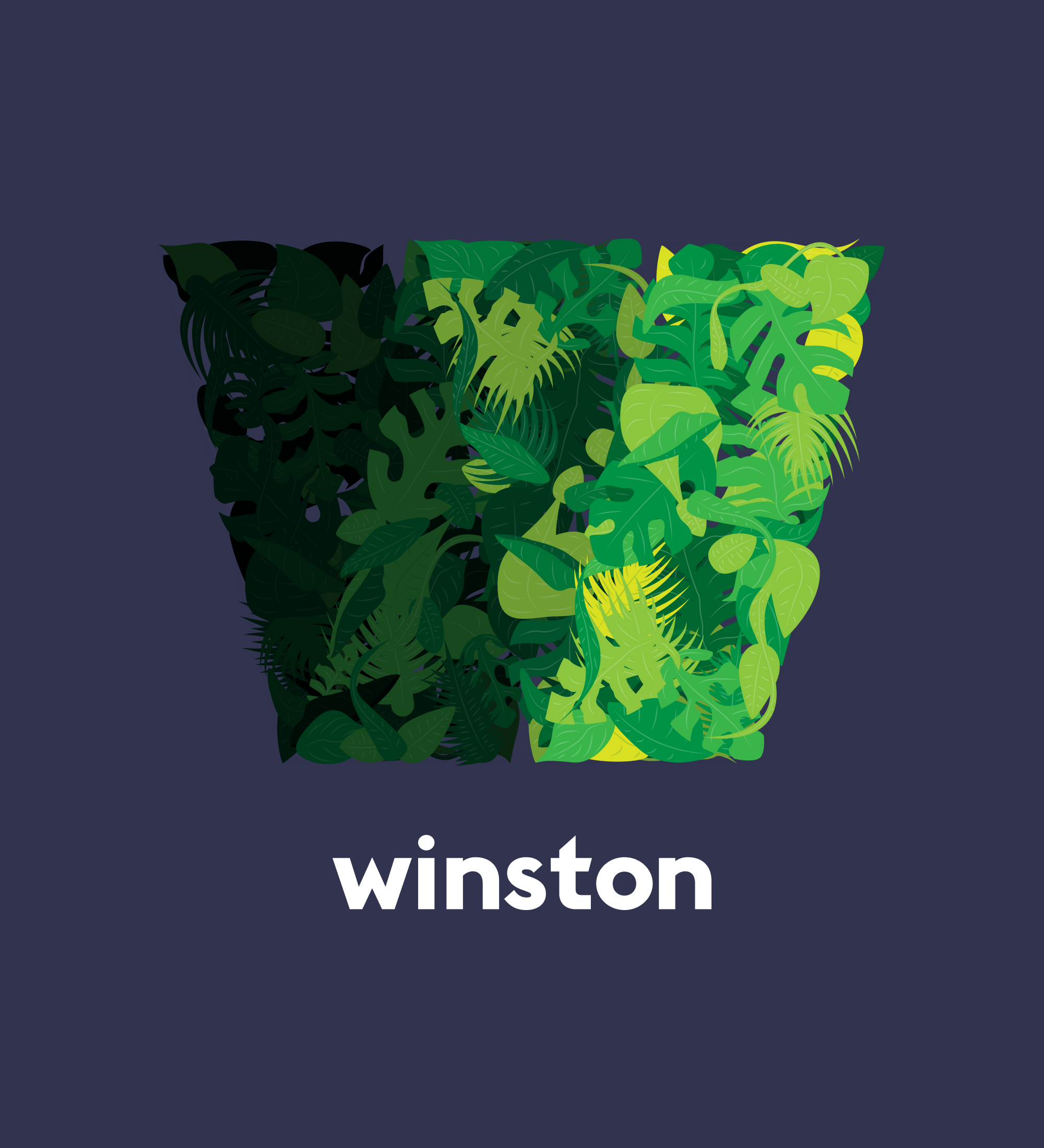
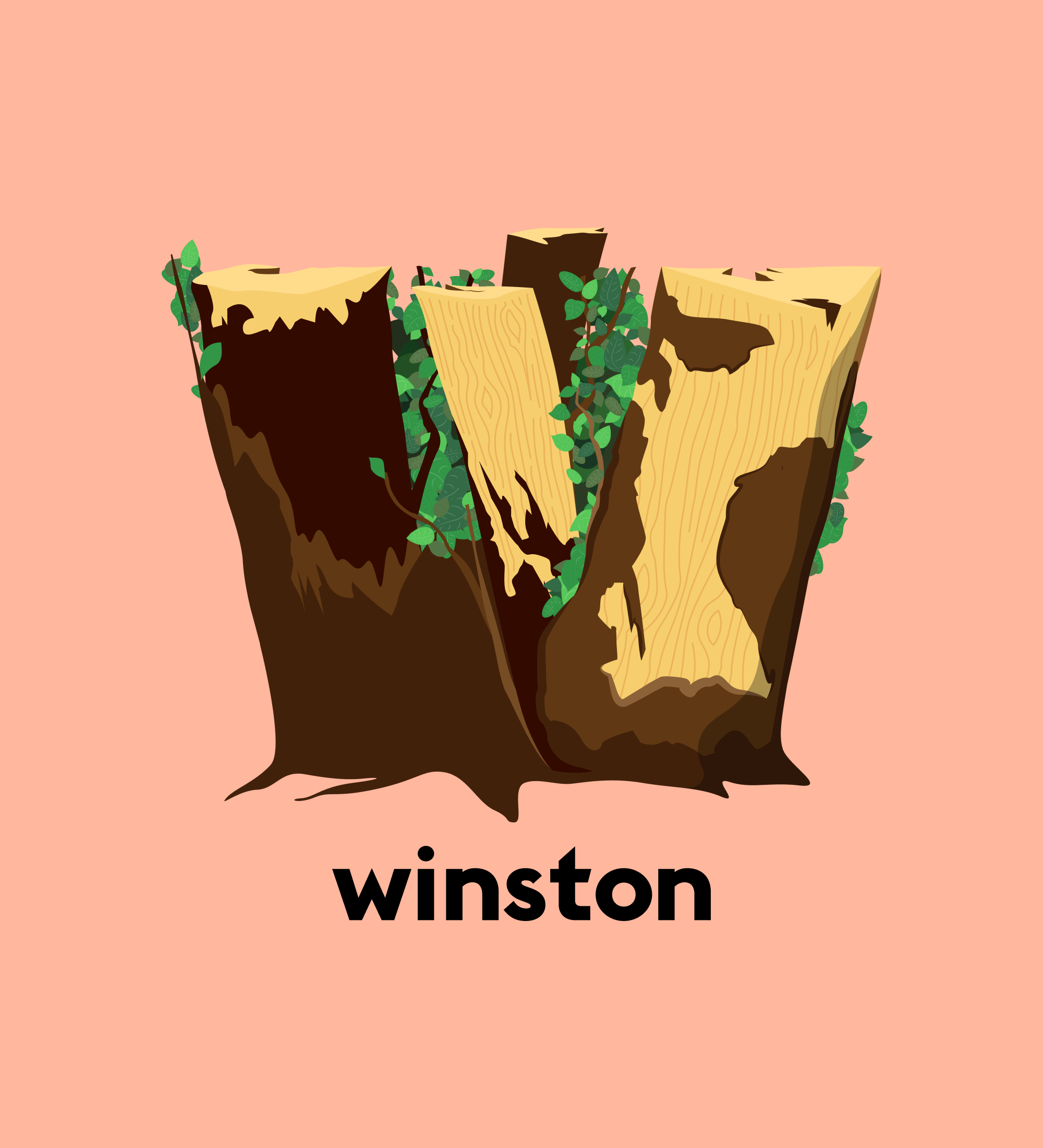
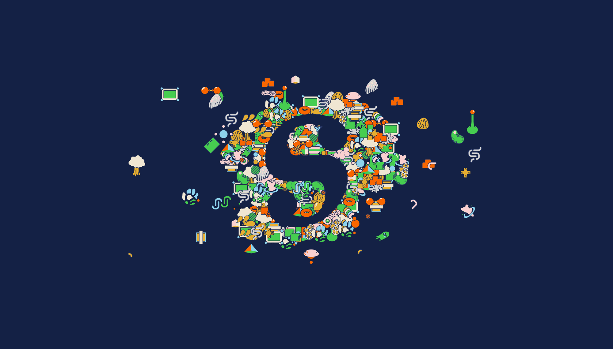
In an effort to retain the company website as a high quality source of knowledge from articles by the employees, a sidetrack of logo visualswere developed to reflect more light-hearted content, such as holiday wishes and current cultural references. Or just a fun way to show offdesign skills and mess around with our own identity.
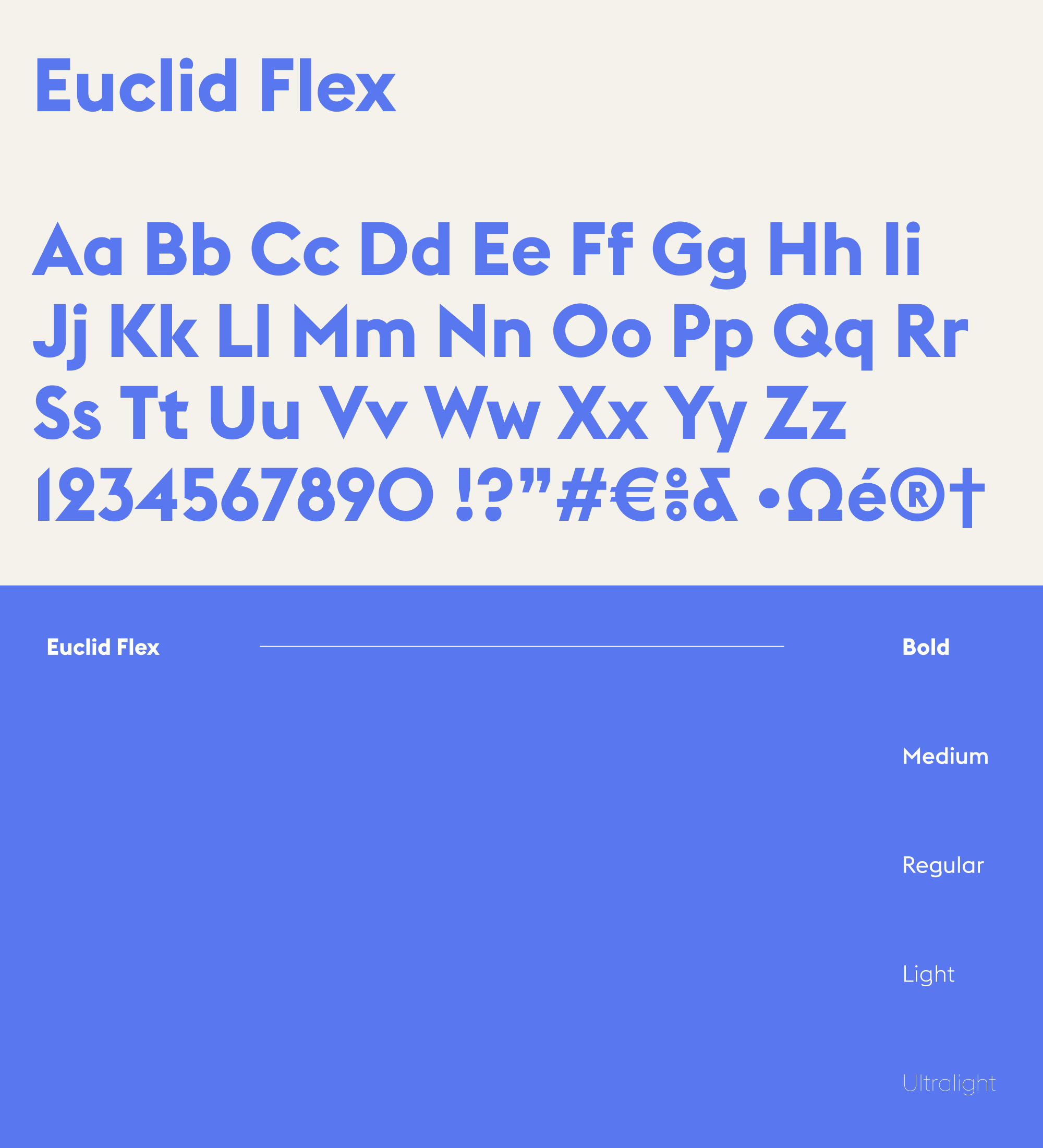
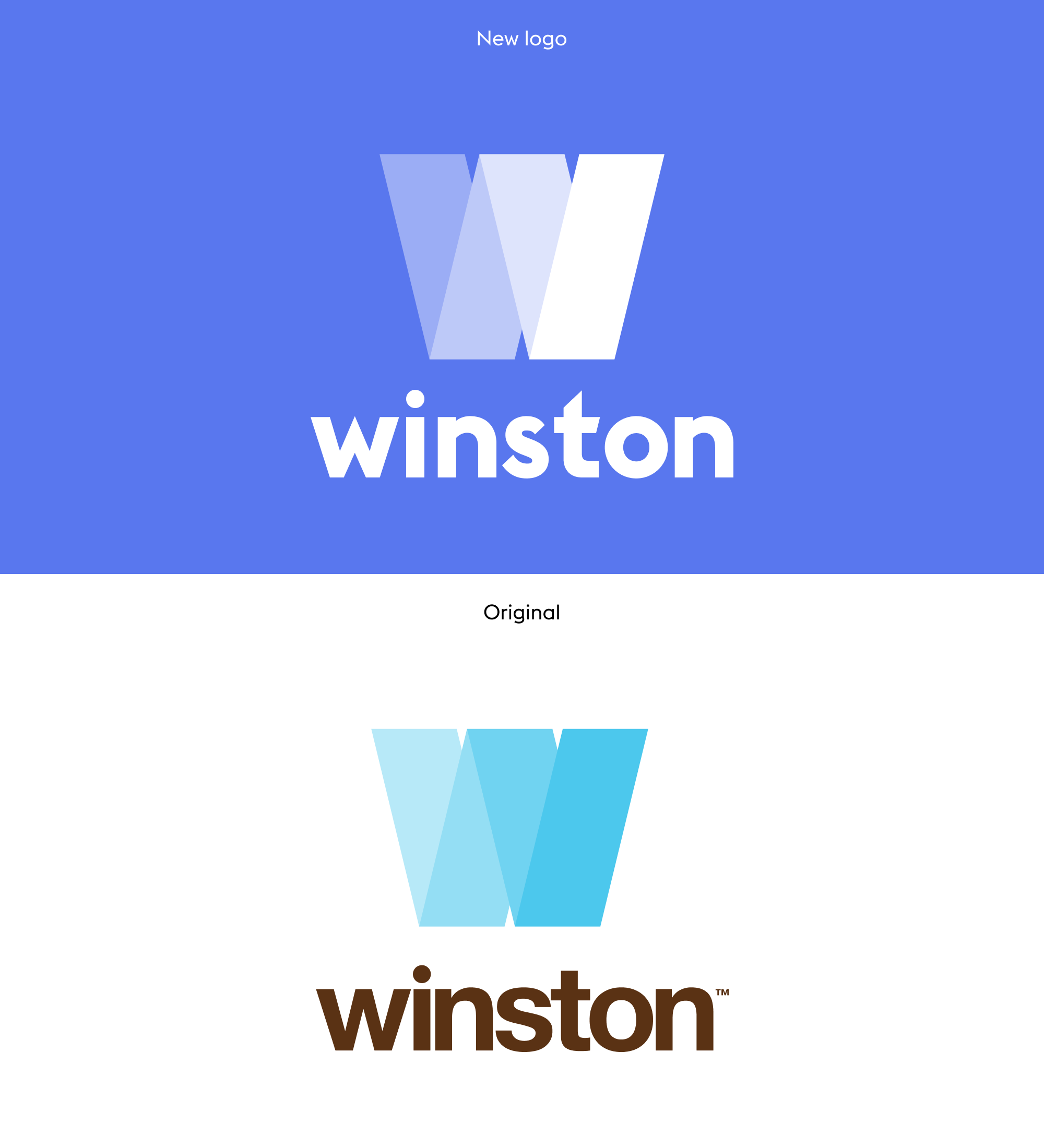
I designed the new logo and concepts pictured here, but the overall project was a collaboration involving multiple in-house designers and competencies.
In an effort to retain the company website as a high quality source of knowledge from articles by the employees, a sidetrack of logo visuals were developed to reflect more light-hearted content, such as holiday wishes and current cultural references. Or just a fun way to show off design skills and mess around with our own branding.