
Rum Magazine is a Swedish architecture and design magazine, published in a Swedish version of twelve issues annually and an English, internationally distributed version every now and then. I worked close with the rest of the editorial staff, as well as with featured artists and architects.
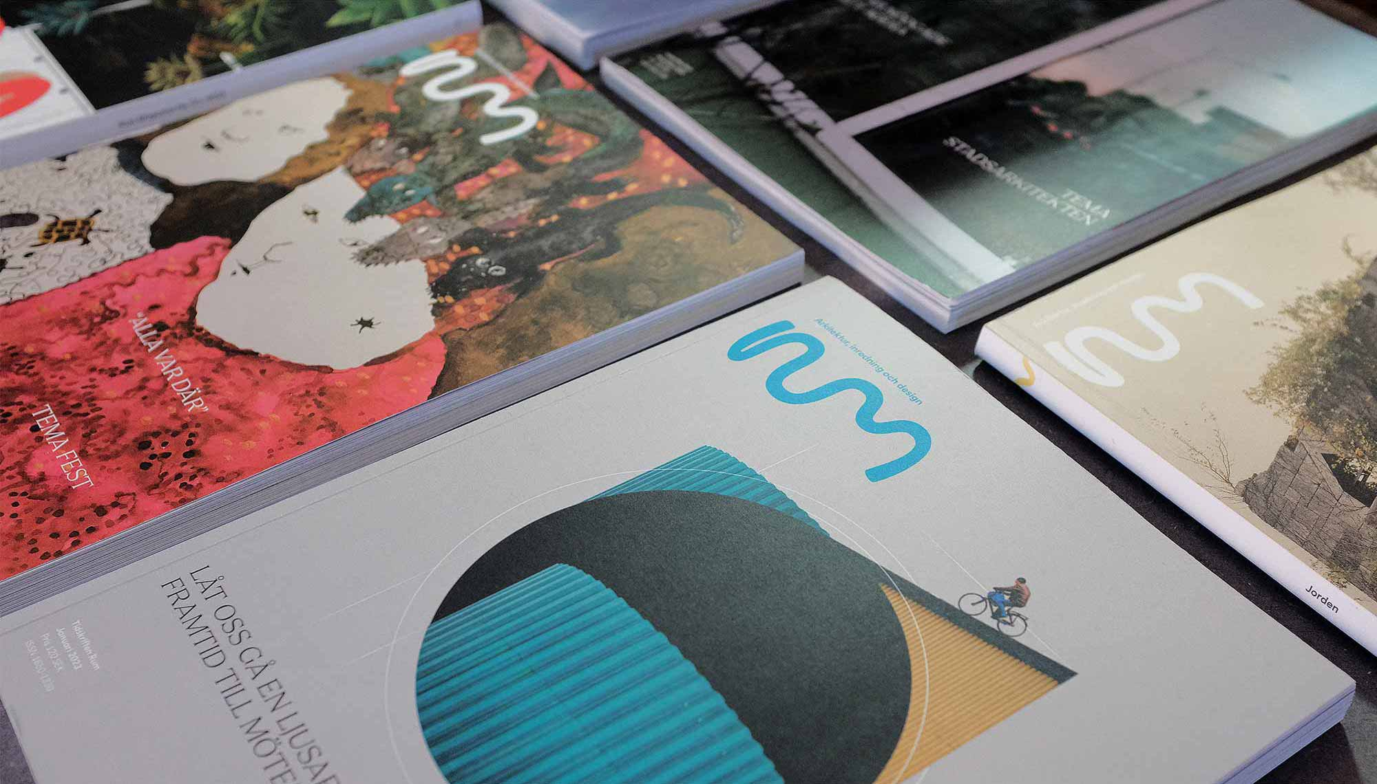
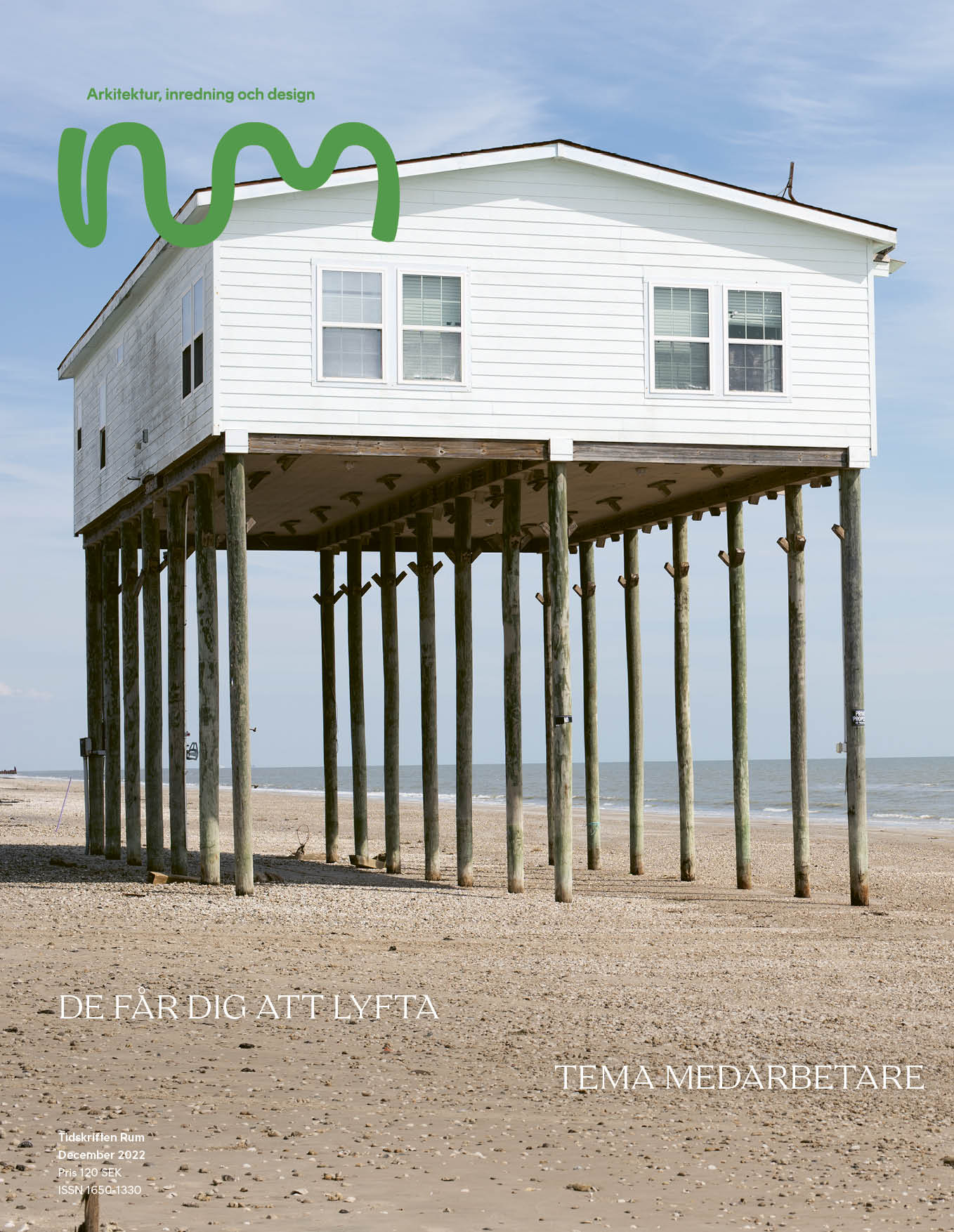
As Art Director I redesigned the entire magazine, changing typefaces and a creating a new layout grid, while bringing my own personal design to the content.
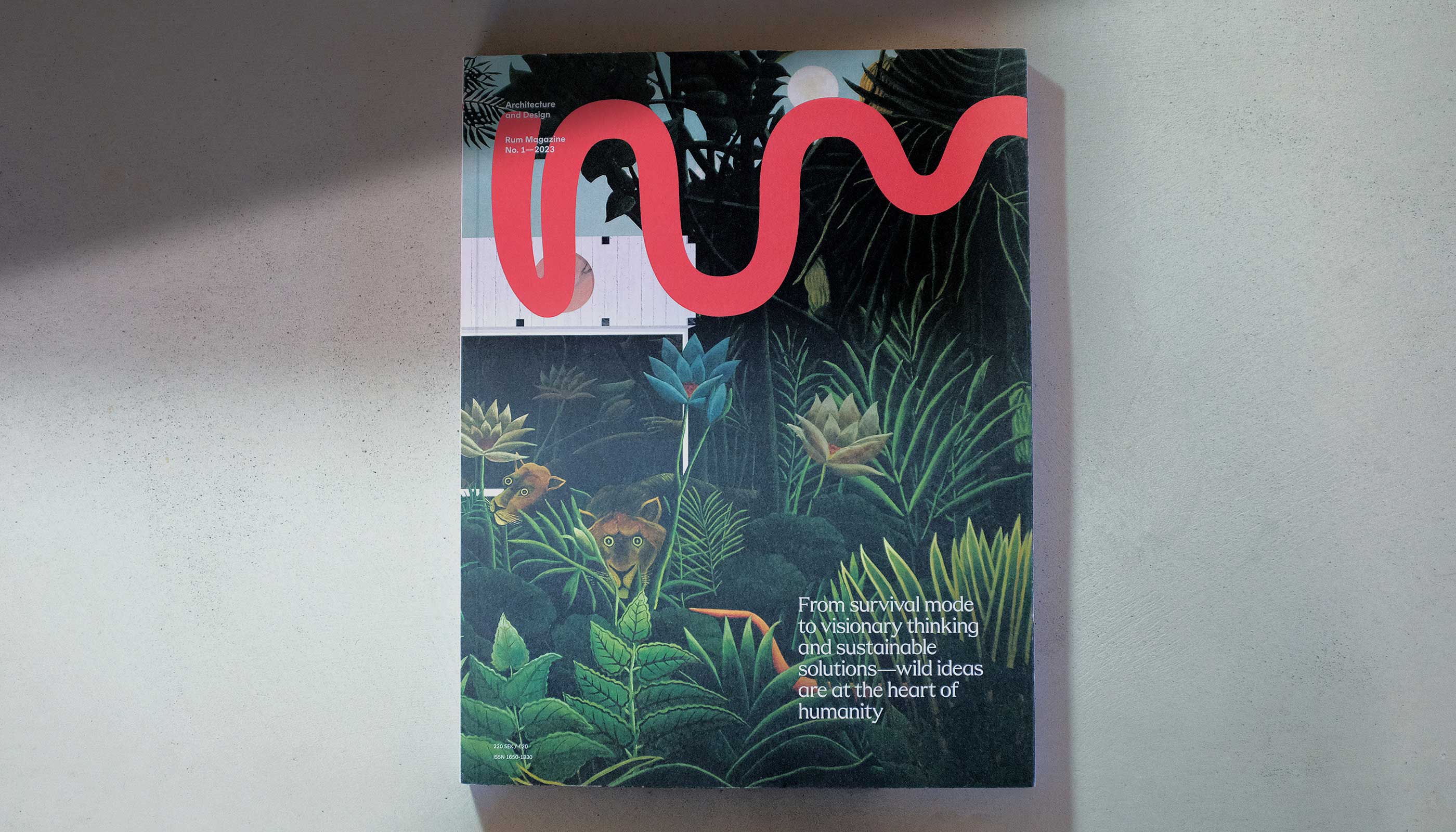
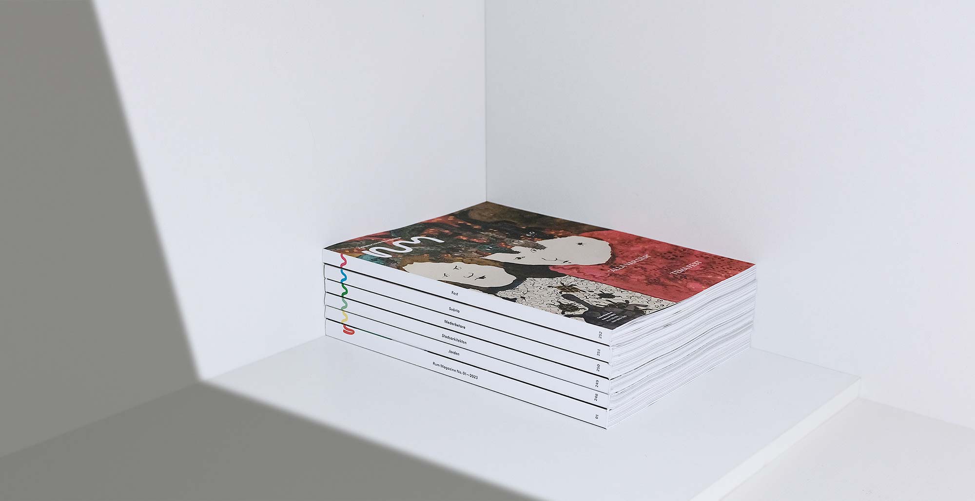
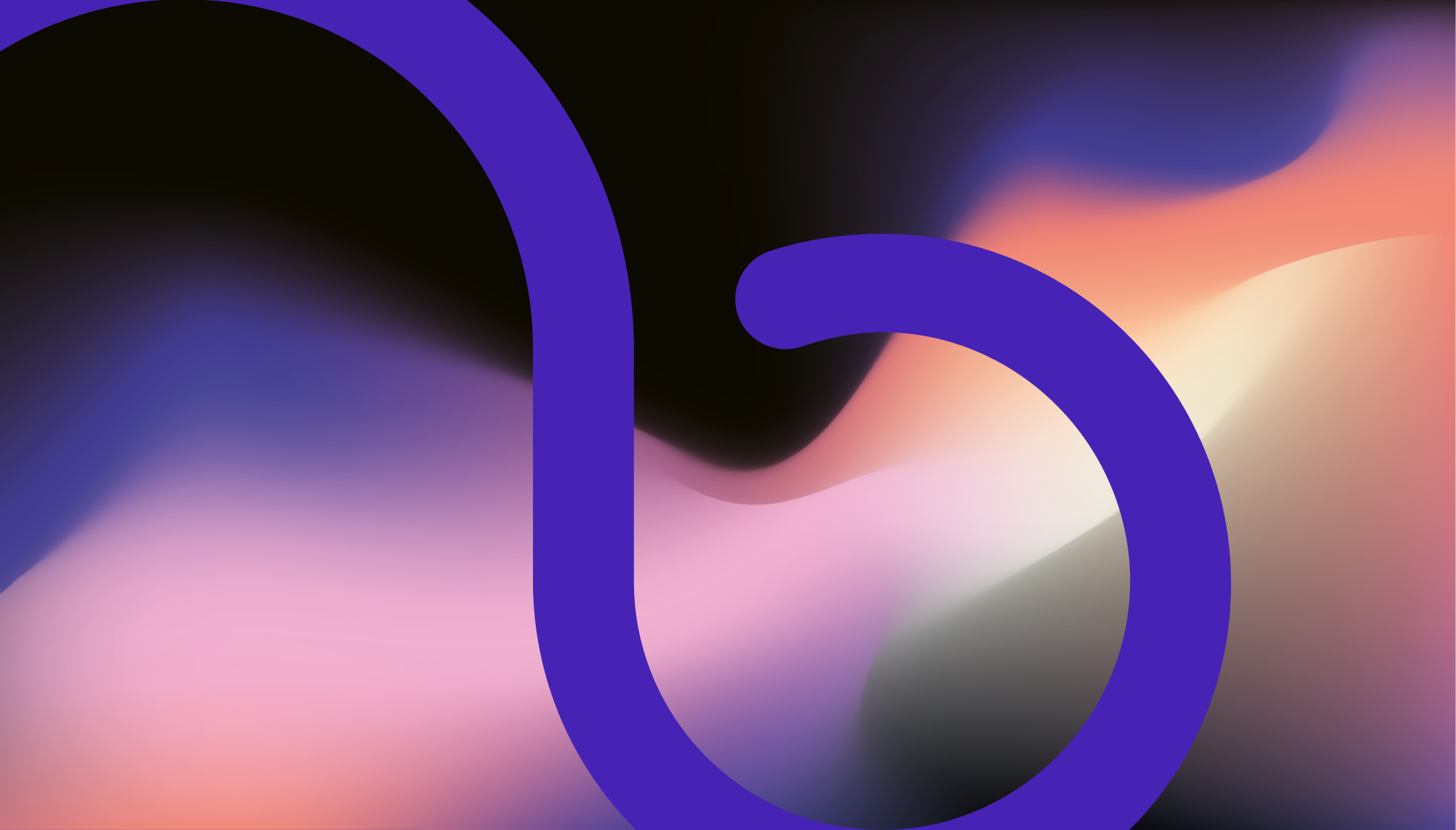
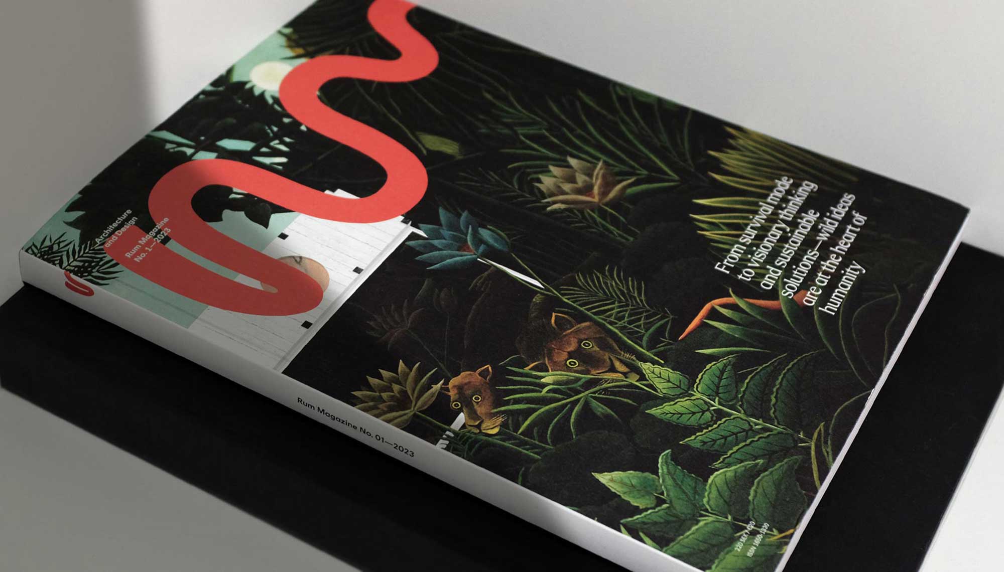
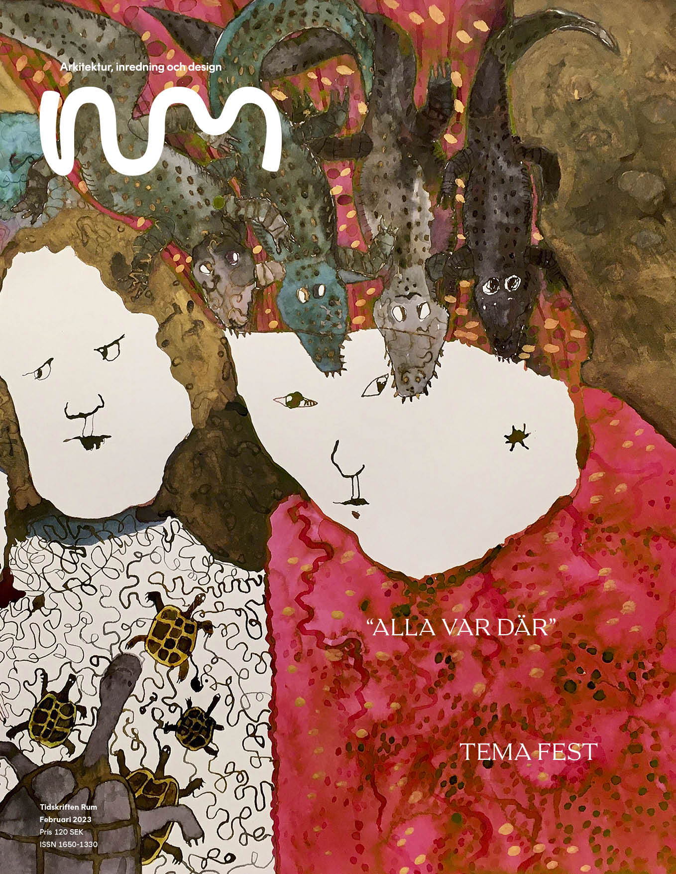
I designed a new logotype for the publication as well – differentiating from competition with a strong visual shape for the eye to latch on to.
With the name Rum – meaning room in Swedish – the magazine could be mistaken for a publication about the alcohol beverage, and not the architecture and design periodical it really is. The new logotype challenge the legibility of the name and shifts focus to the shape and expression. This nudges the viewer to read the text information surrounding the logo – ”Architecture and design” + “Rum Magazine” – getting the info needed for context. It also promotes differentiation from other magazines with similar naming. The organic shape of the logo has a certain mood to it that fits the tone of voice of the magazine. Details of it can repeat and create patterns, or be cropped into large graphical pieces.